About Freitag
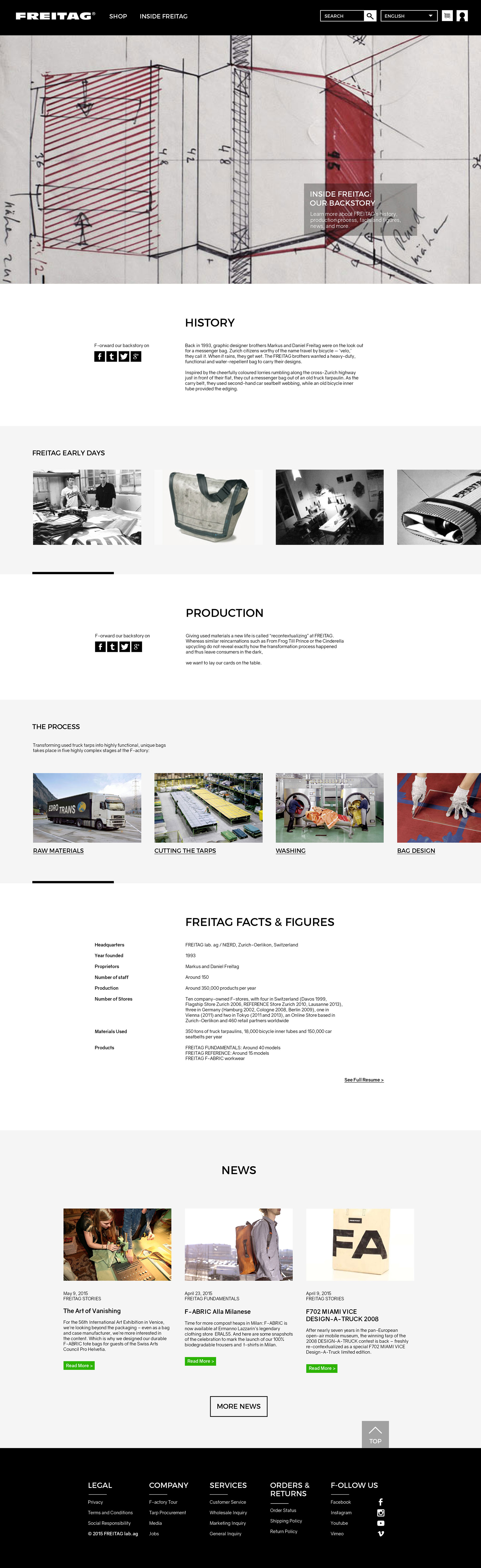
Freitag is a swiss bag/accessory design company known for their sustainable and sturdy bags and accessories created from upcycled used tarps and industrial materials. Freitag has fans all around the world from Switzerland to South Korea.
Problems
There are a lot of unnecessarily repetitive informations on their current website. Some of the names of the tabs either on the navigation or the footer are misleading thus create confusions among the users navigating through their website. Also, it is not responsive so it is hard for the users who are accessing the website through their tablets or phones.
Solution
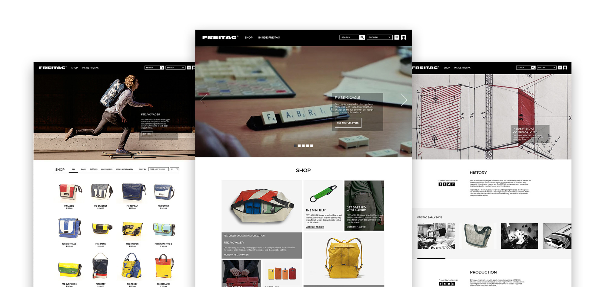
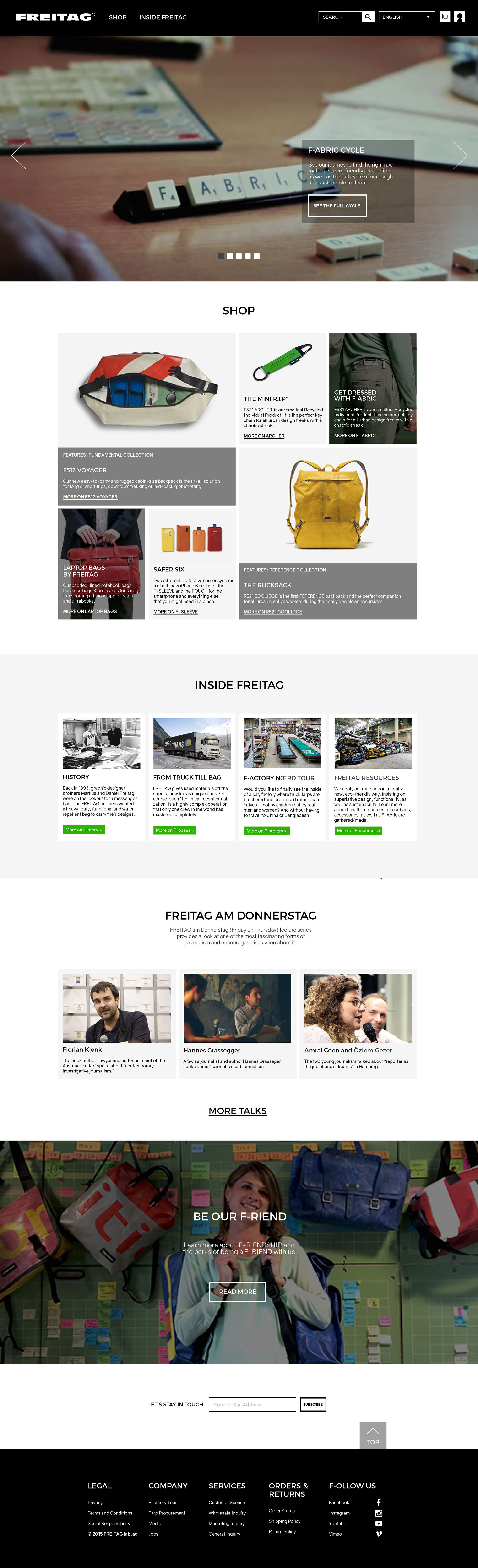
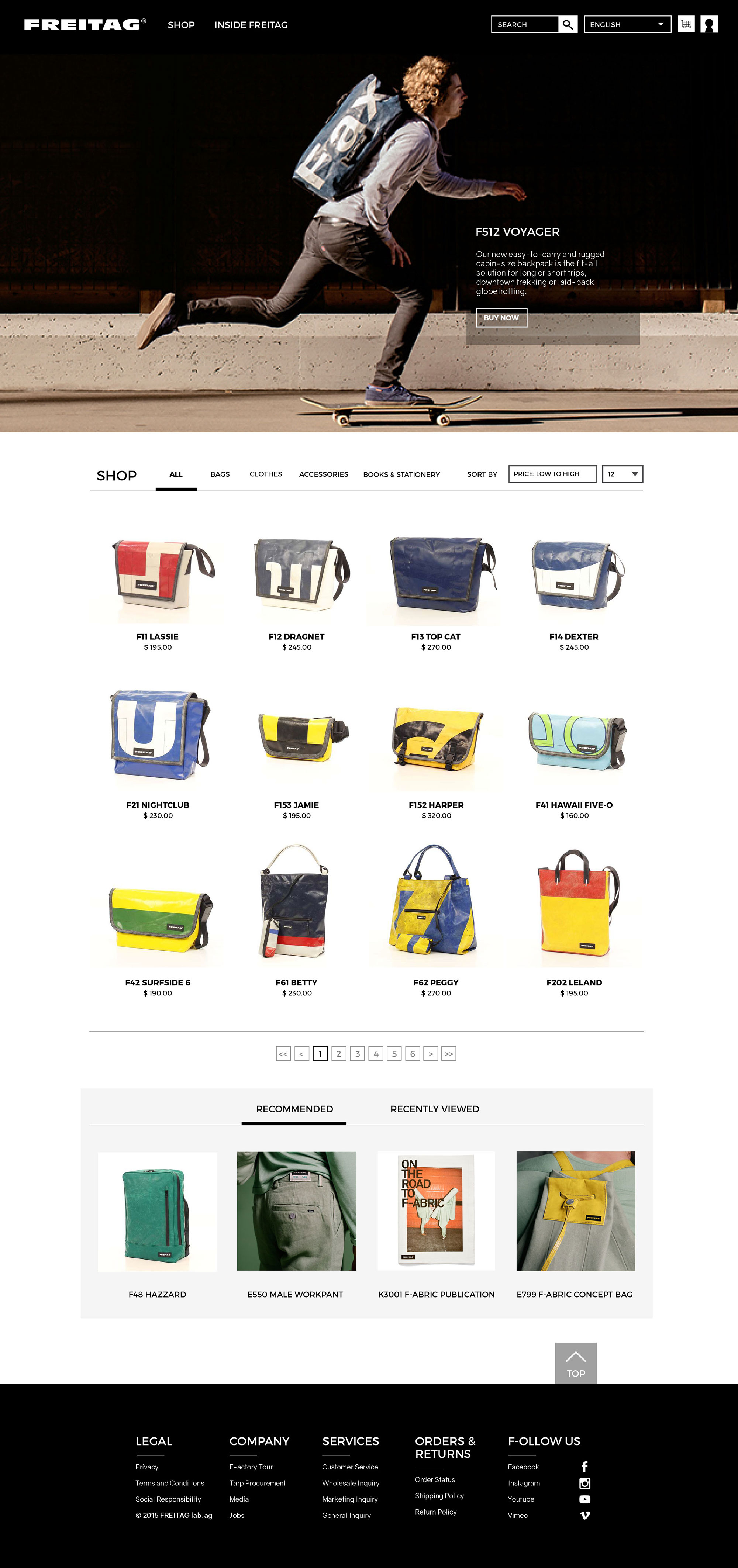
For this project, not only I wanted to make the website responsive, I wanted to better organize the information on the website so that it would be easier for the users to navigate through the website.
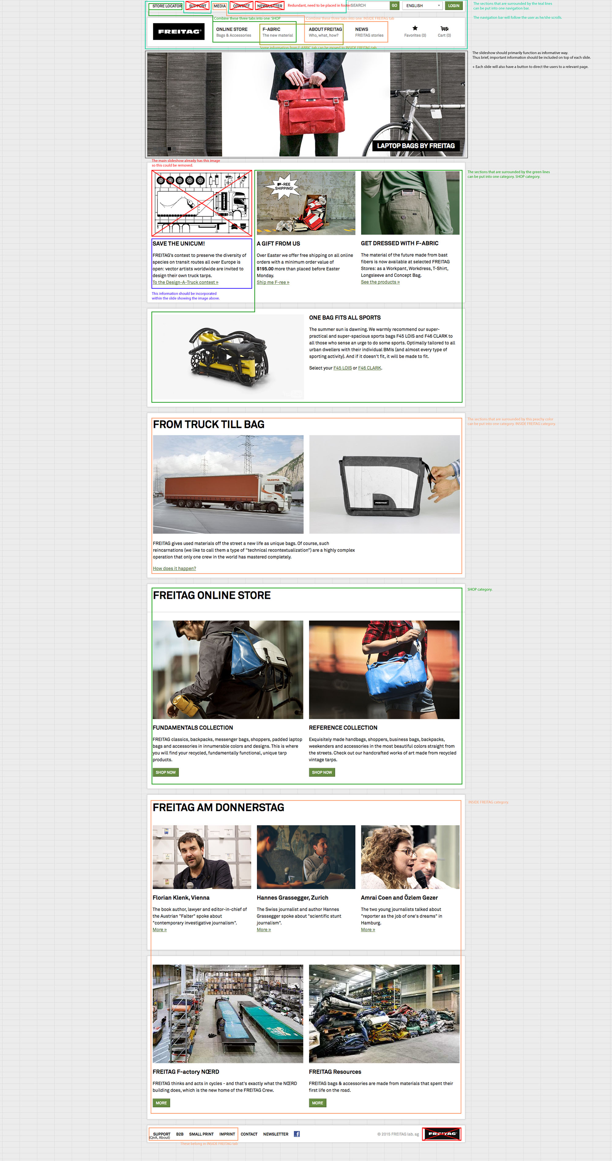
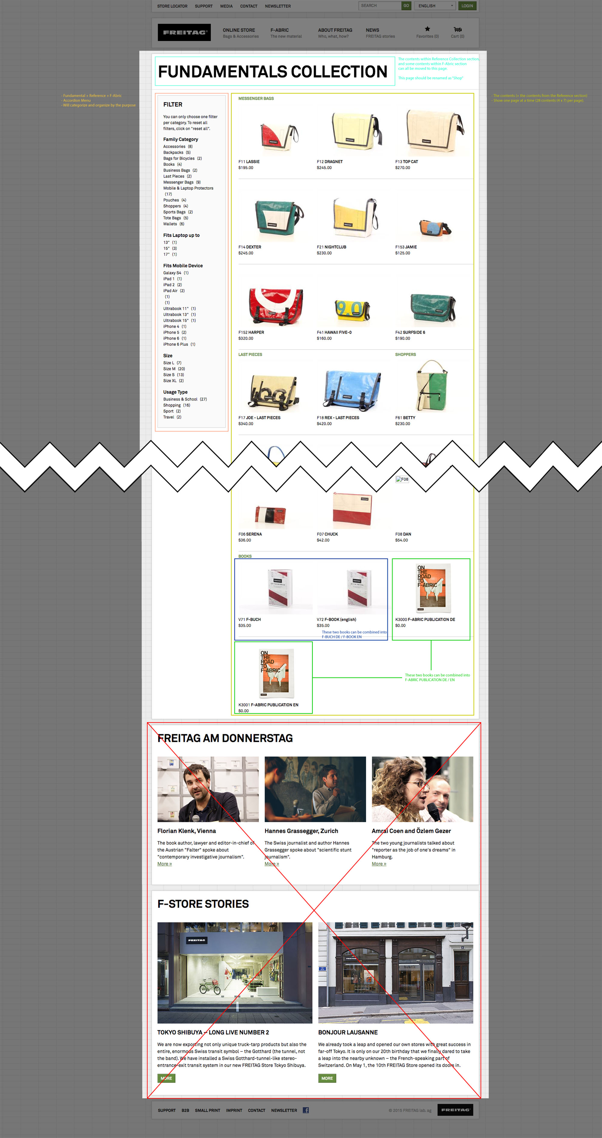
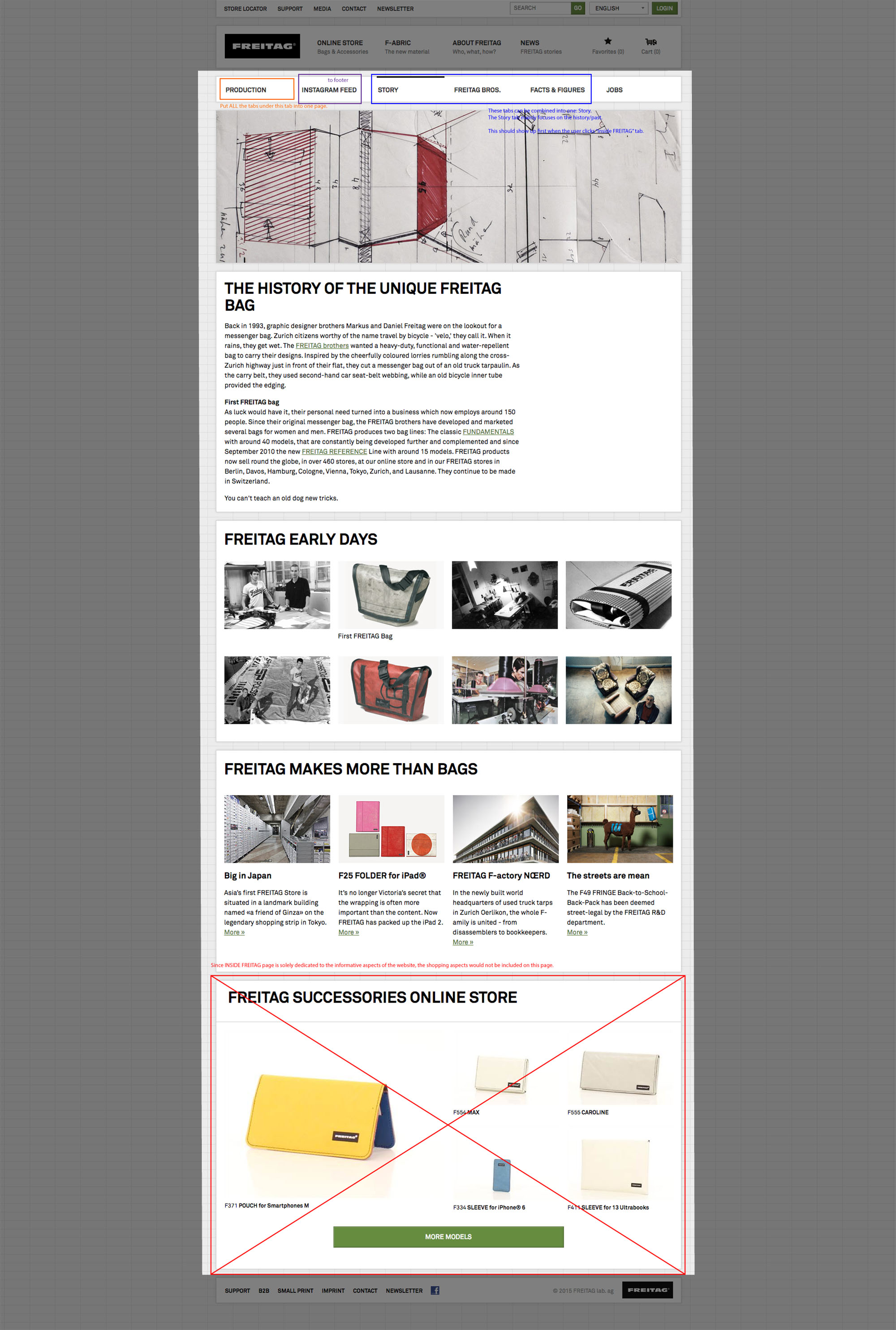
After taking screenshots of the three web pages, I created .pdf documents proposing/explaining which contents need to be kept, moved and/or removed.
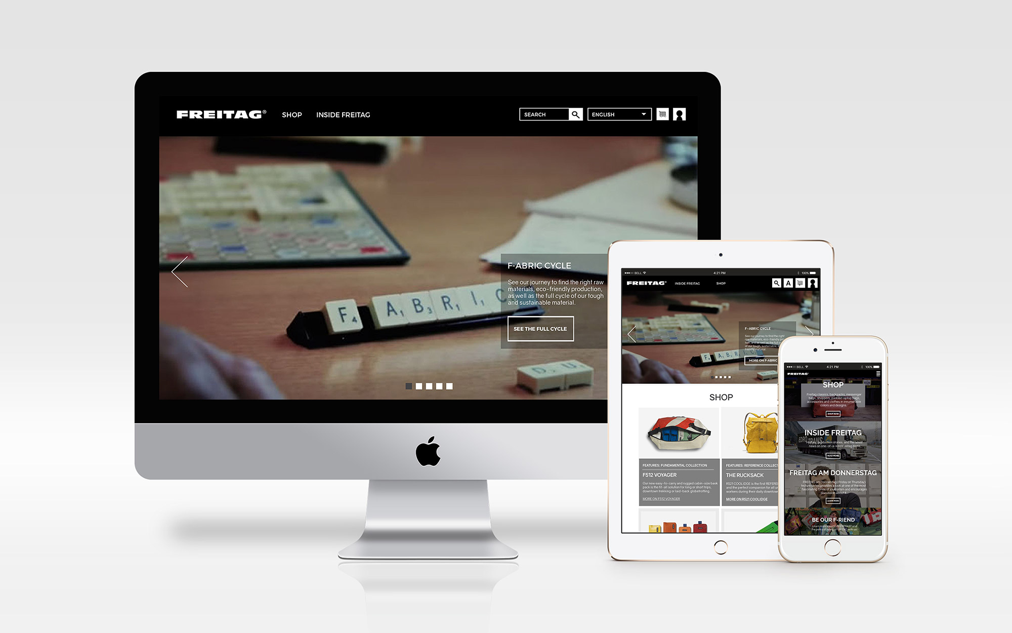
Although most people access to the website through a desktop or a laptop, responsiveness helps the users who are using tablets or smartphones to access the website. To ease their pain of pinching-and-zooming to see the content, I designed how the website would behave on different platforms
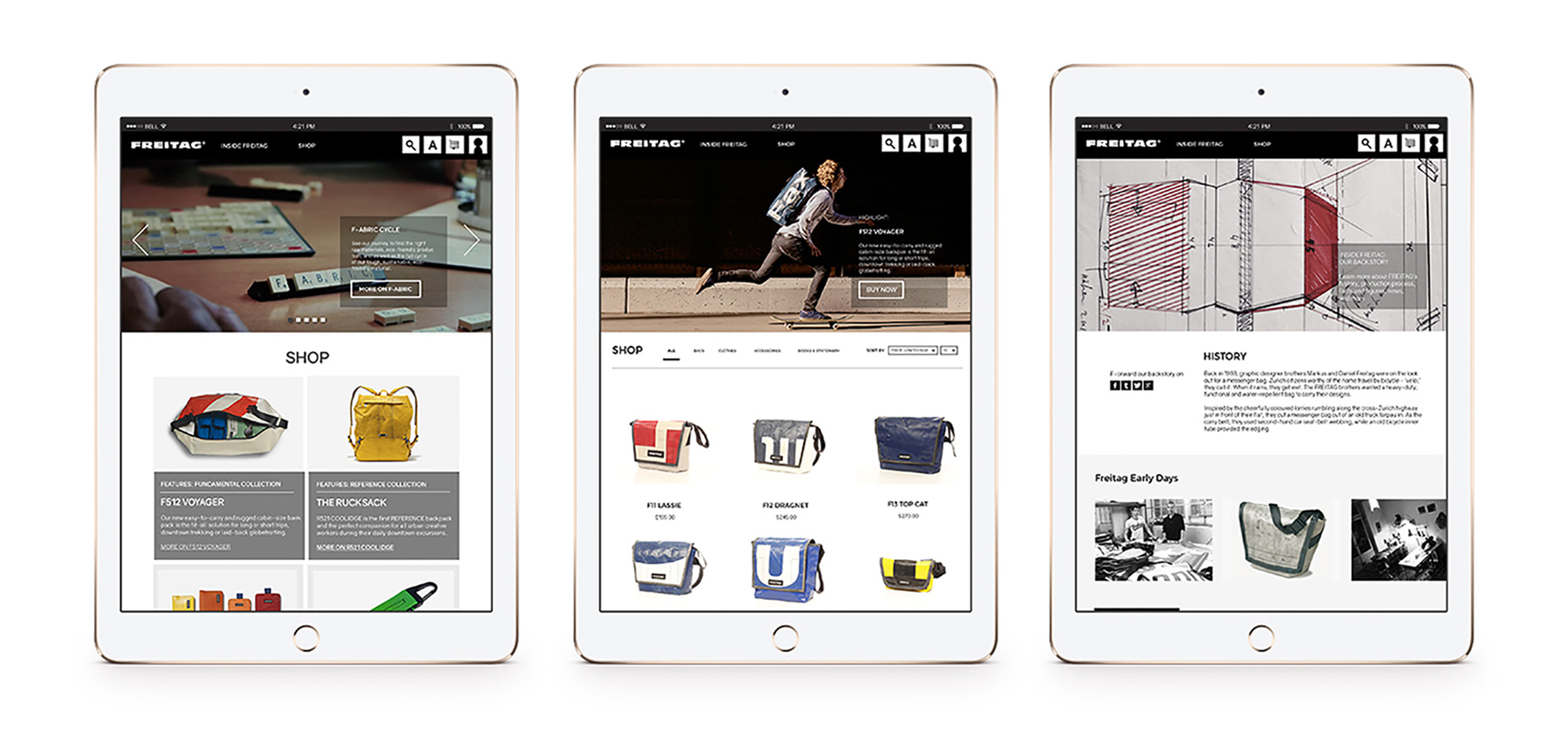
viewed on tablet
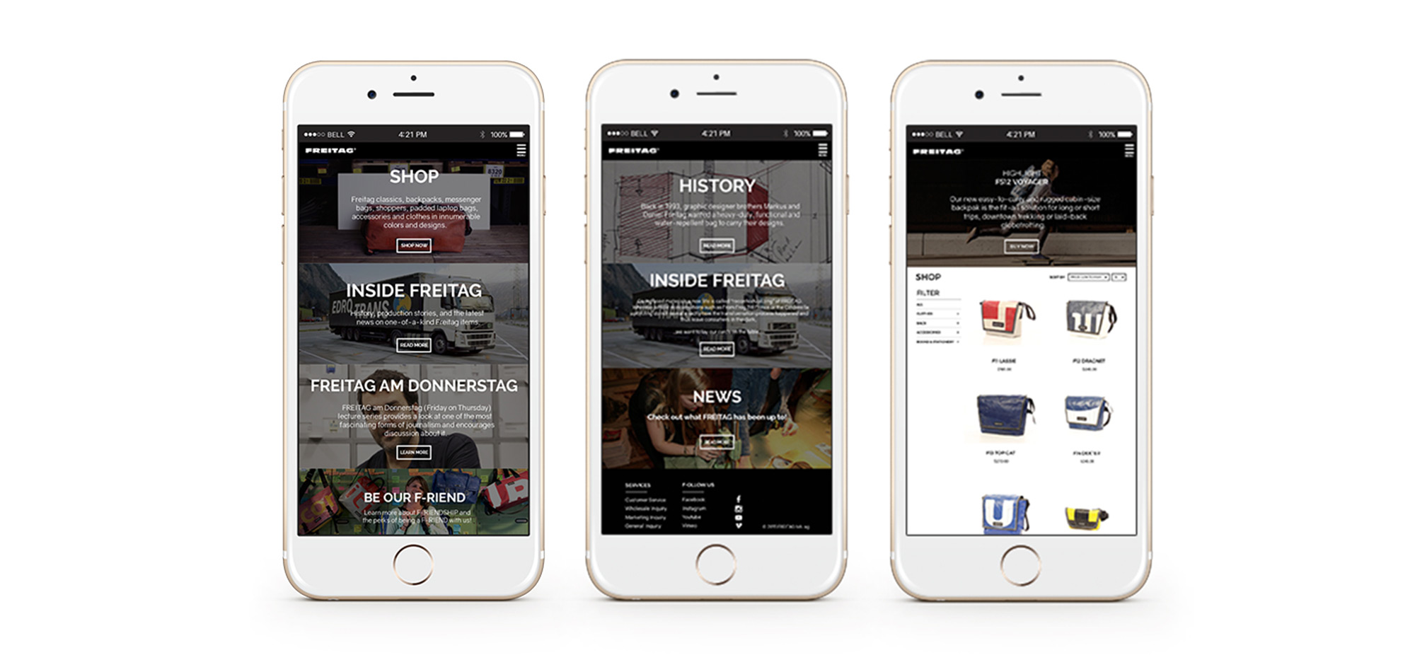
viewed on smartphone