About Yelp
Yelp is a public company founded in 2004 to help people find great local businesses. It started as a company that publishes crowd-sourced reviews about local businesses. Nowadays it also hosts online reservation (Yelp Reservations) and food delivery service (Yelp Eat24). Yelp had a monthly average of 23 million unique visitors who visited Yelp via the Yelp app and 69 million unique visitors who visited Yelp via mobile web in Q2 2016.
Challenge
Other than the problems with Yelp's set of confusing marks which have not been changed since the beginning of their business in 2004, Yelp is losing its credibility because it has been accused of pressuring businesses into using their service or risk being black balled. Despite Yelp has been one of the oldest find-local-businesses type of company, it is losing the battle against relatively new competitors like Foursquare and Google Places.
Goals
The rebrand must emphasize that Yelp has been around longer and has a more established base of reviewers. Yelp has also won the war of selling small- and medium-sized businesses on the value of courting customer reviews. Yelp has also done a better job diversifying outside of the bar/restaurant/hotel industry. In fact, more than two-thirds of their reviews are for non-food and beverage establishments. Also, needs a new navigational strategy for the better user experience on mobile and web.

Problem with their current identity
The original designer's inspiration came from comic strips, where often times a little asterisk would appear above a character's head in a moment of funny discovery. But the abstraction of the asterisk lead to the "burst". Many users find the mark confusing. While the mark next to the wordmark is supposed to be a "burst", some think of it as slices of pizza, a flower, etc. The offset counters of the letter ‘e’ and ‘p’ create unnecessary tension. Yelp has not changed its logo mark since the beginning of their business in 2004.

Solution
The name “Yelp” came from a friend of the founders who simply liked the word. However, it also serves as a nifty contraction of “yellow pages”. Yellow pages' core purpose is finding a location's information. Since Yelp is losing credibility from some users, with Yelp going against their initial direction, I made the mark so that it would reflect that it should go back to the basics, stick to the initial resolution, of providing information to customers.
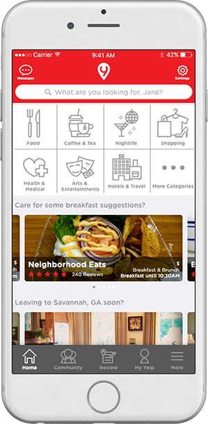
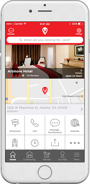
Since more than two-thirds of the reviews on Yelp are non-food related, it is important to make those information accessible to the users. By making those categories more visible, the users would have a better access to the information. Modular grids help the user see more information in less amount of space of the phone screen. Slideshows help the user see more content in less amount of scrolling.
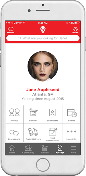
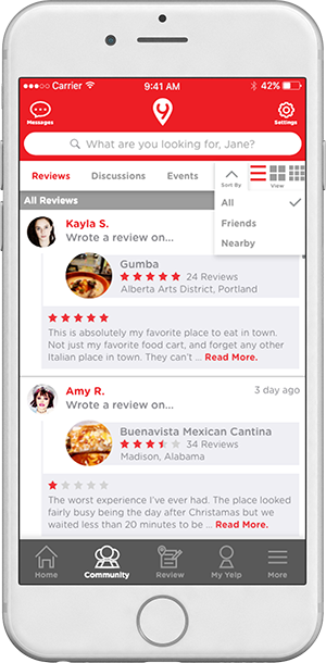
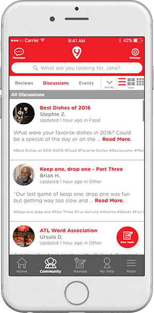
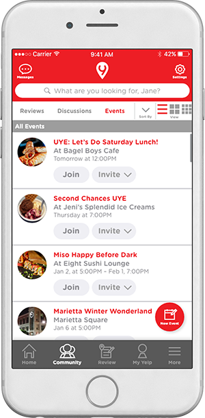
One of the core purposes of Yelp is to bring the community together by sharing information. It was important to organize the content based on that core purpose. By categorizing important functionalities into one tab, the user has a much easier time to navigate through the app and get the information they want.