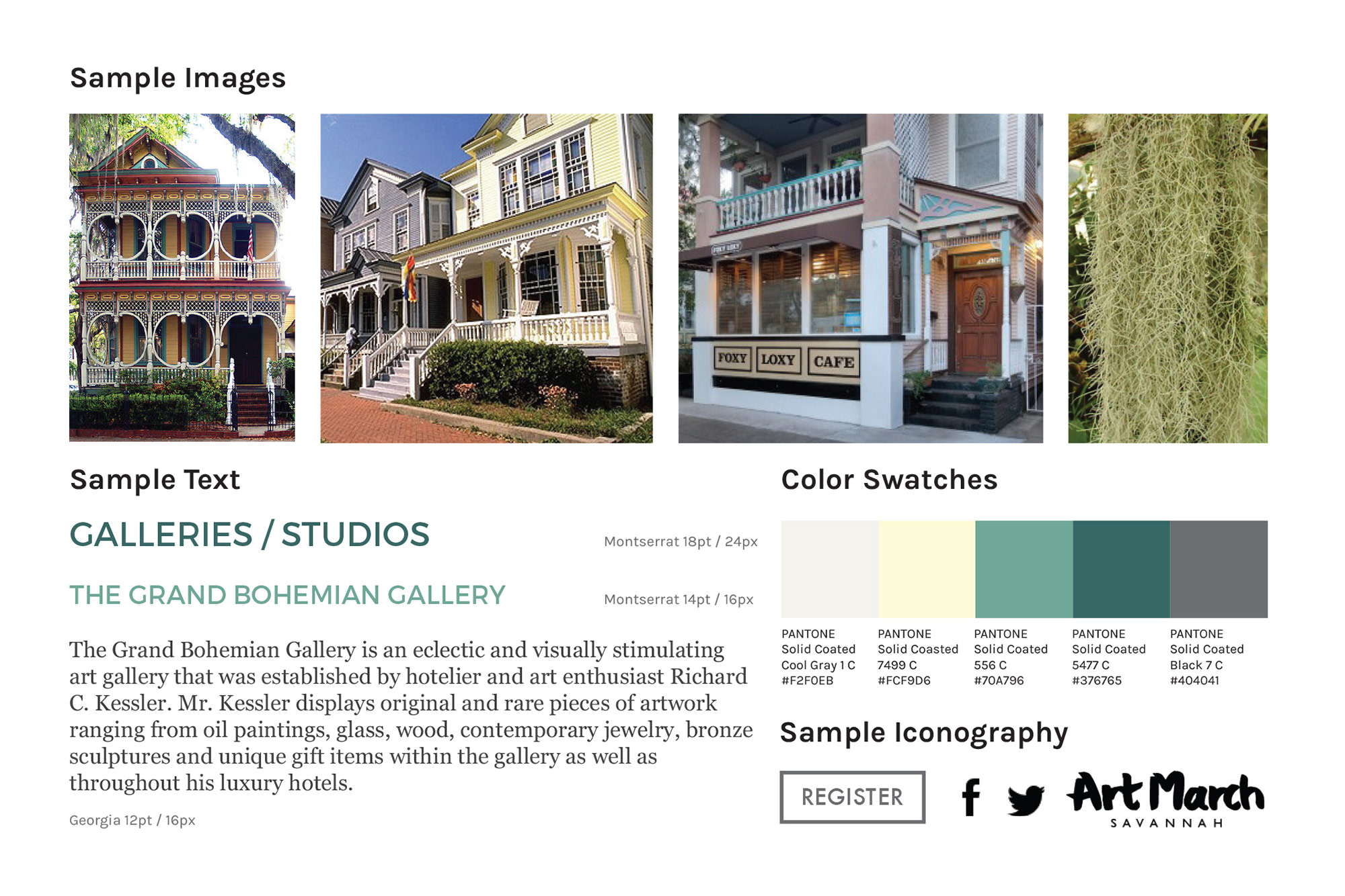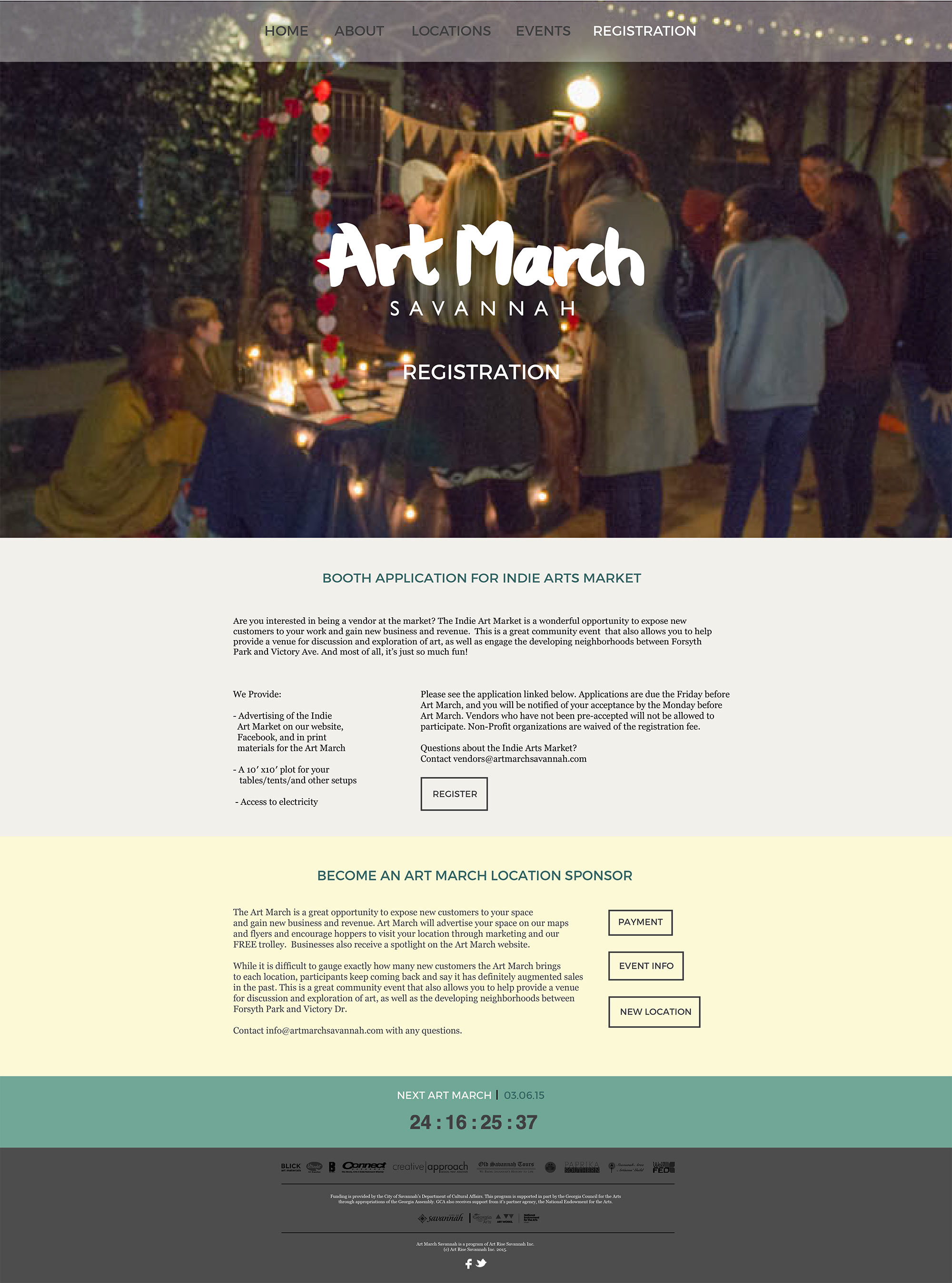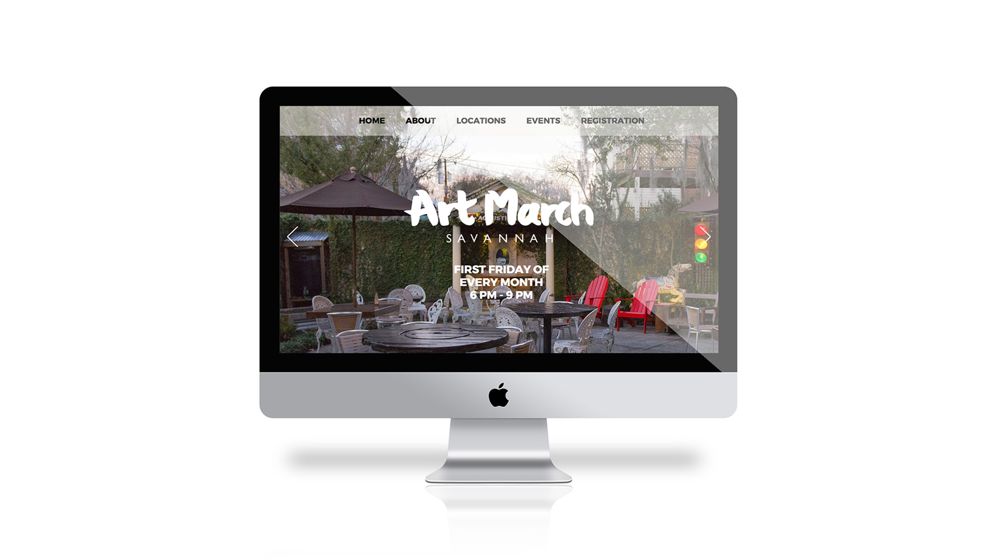
About Art March Savannah
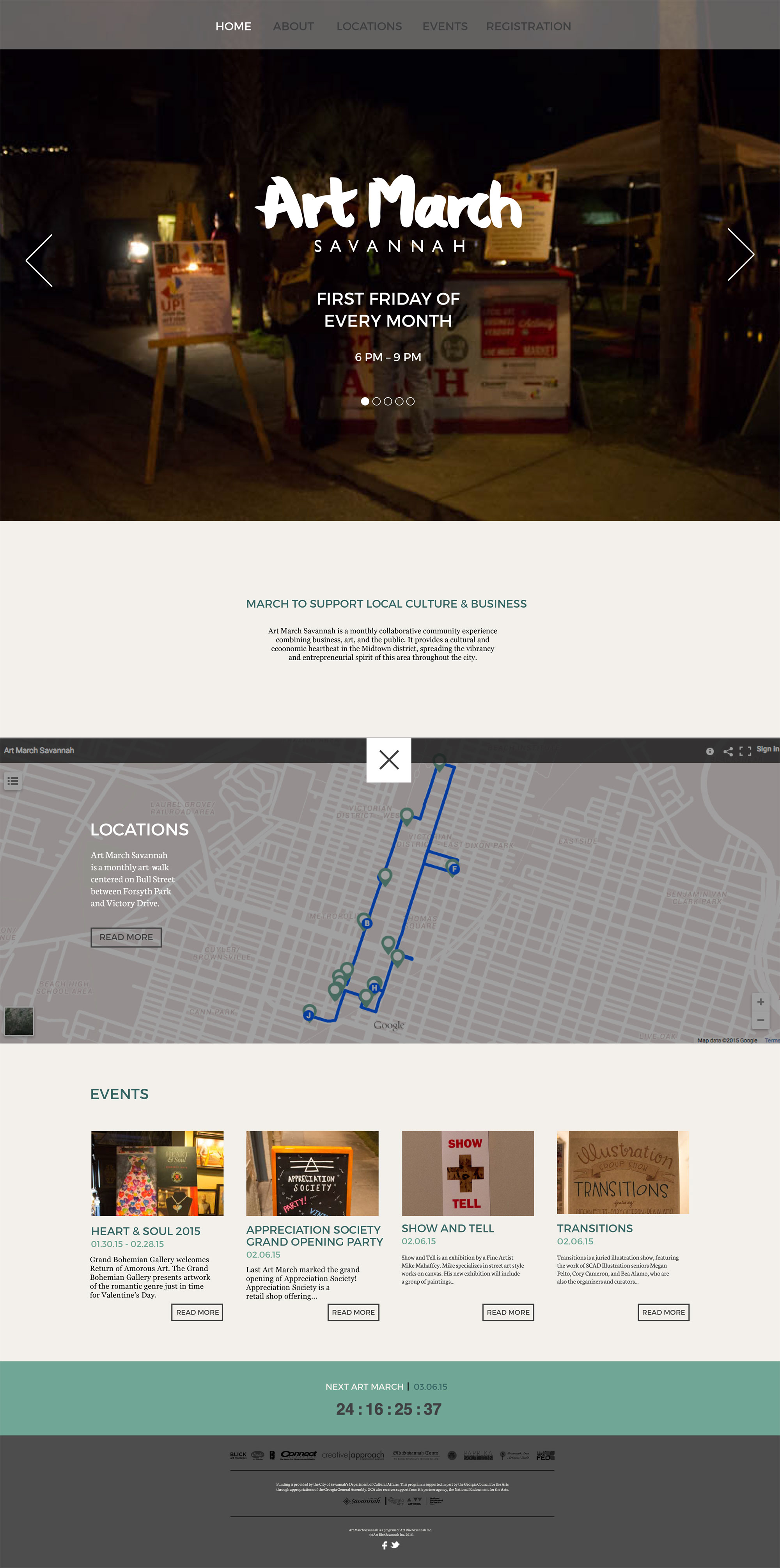
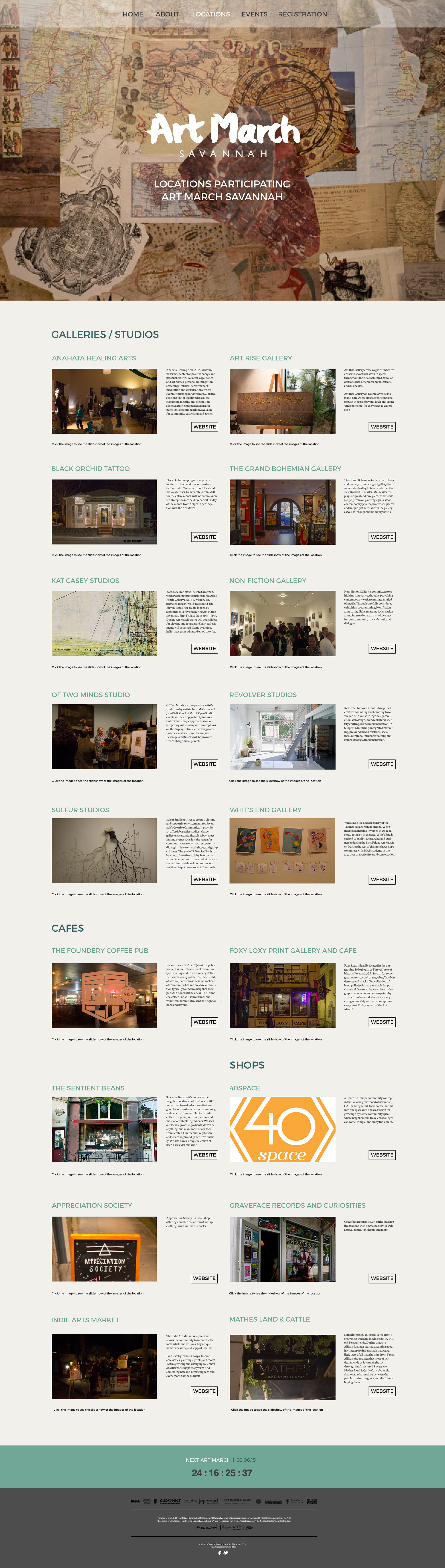
Art March Savannah is a "monthly collaborative community experience combining business, art, and the public." There an attendant can attend different exhibitions, watch live performances in cafes or galleries, go to indie markets to do some vintage clothes shopping, vinyl record shopping, etc. The kind of artworks being showcased are such as but not limited to: paintings, photographs, prints, sculptures, digital art, and performances.
Problems
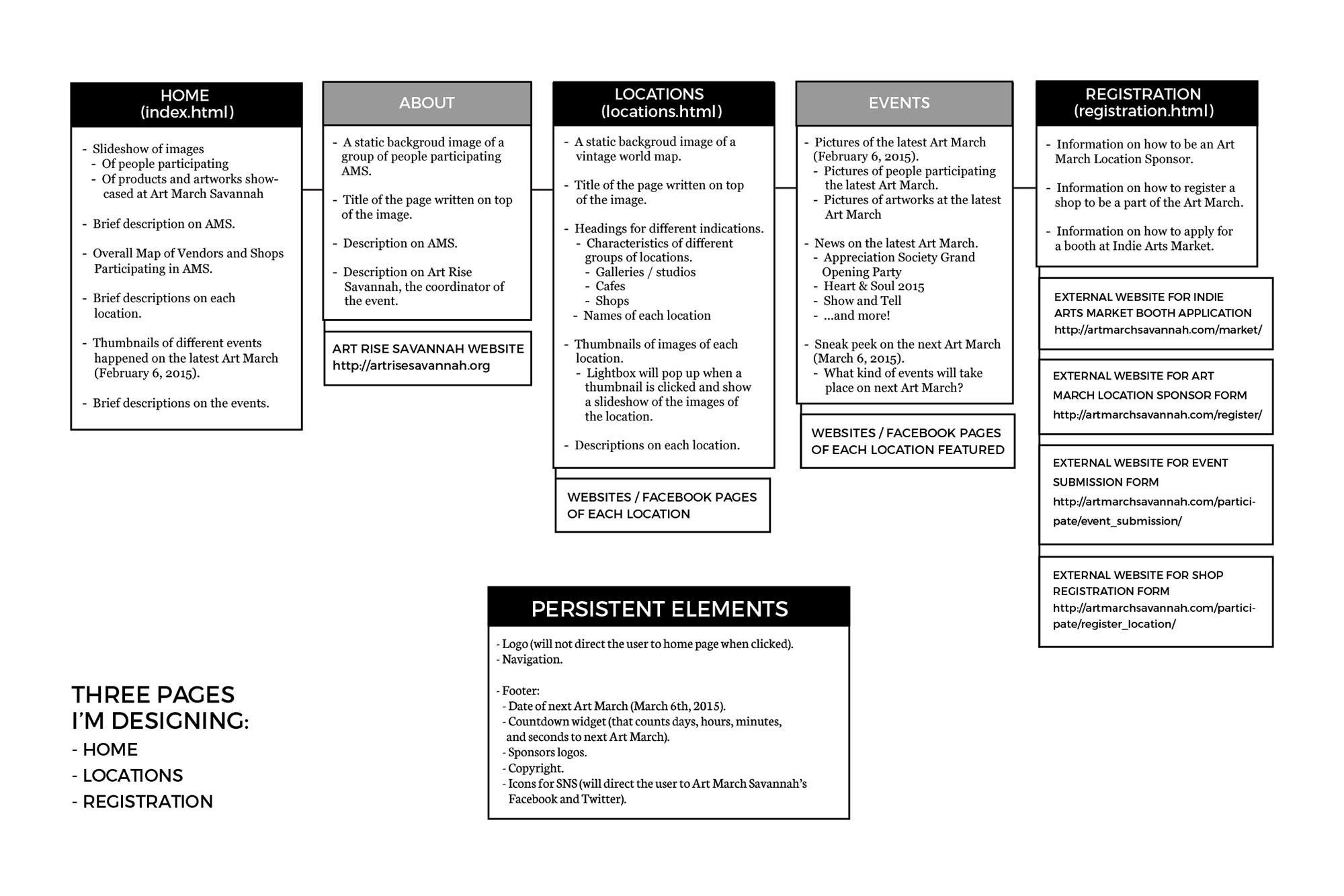
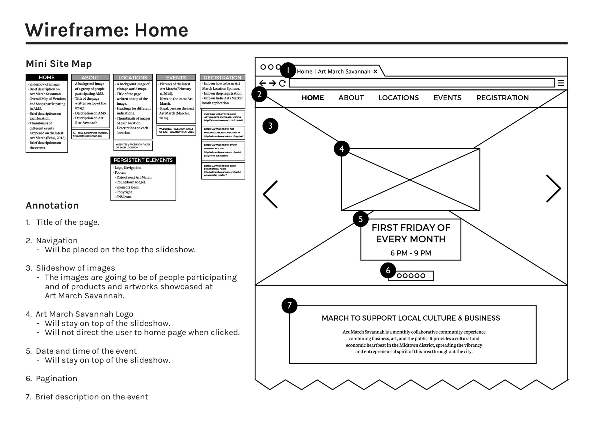
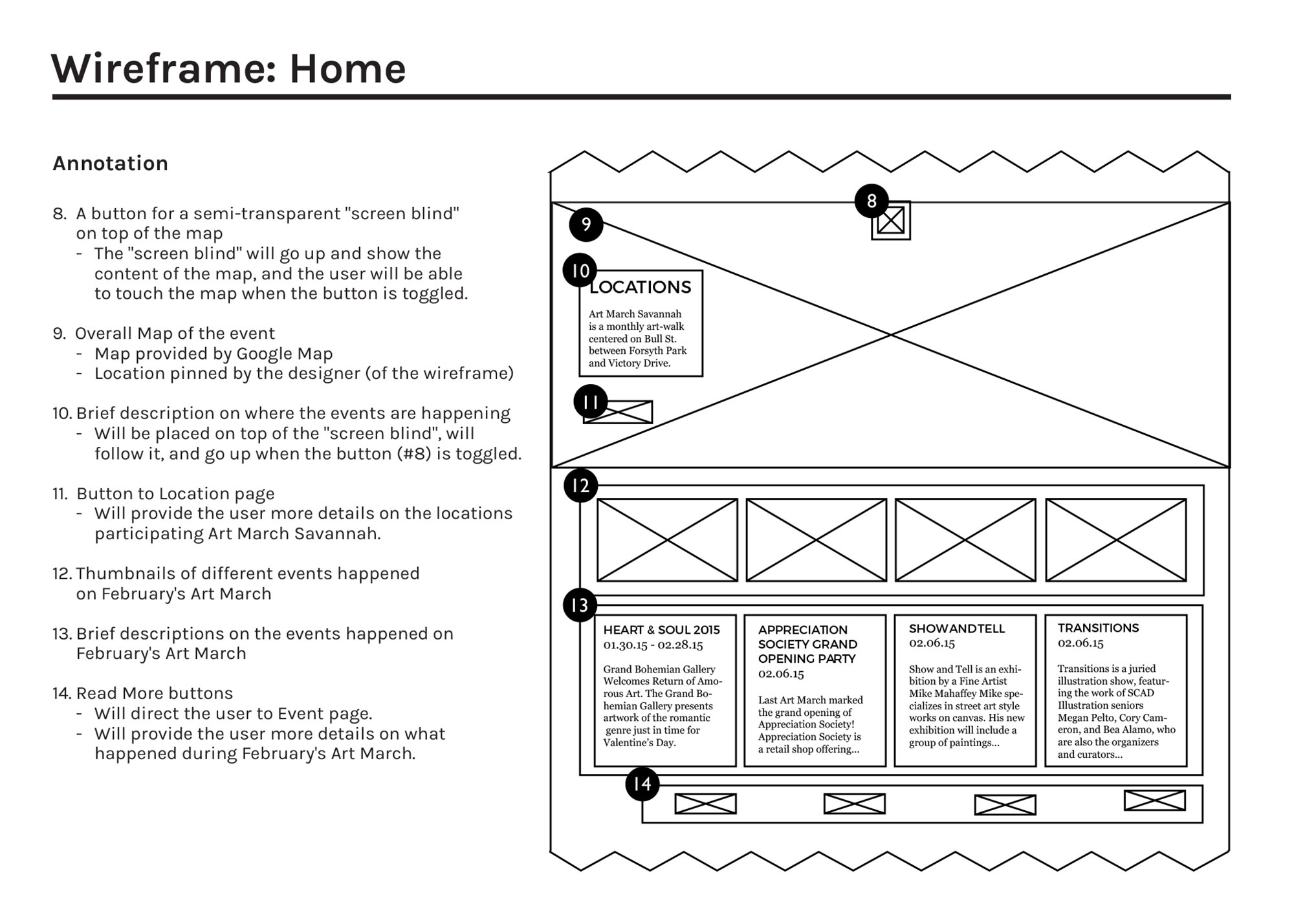
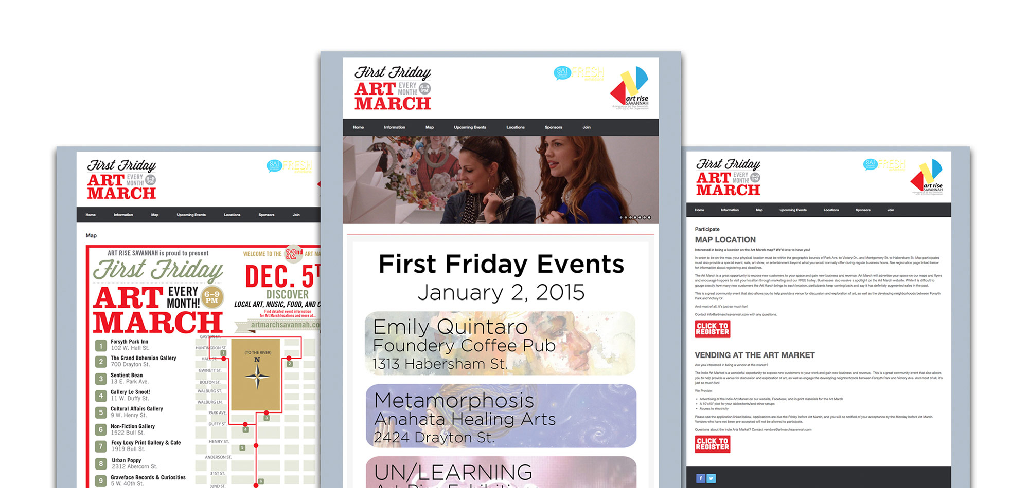
The following varieties are not effectly conveyed through their overall branding: of the activities an attendant can do; of the genre of the artworks shown during the event; and of the demographics of the event. The ways a person can have an access to the information on Art March Savannah is through their website and the Facebook page. However, Art March Savannah is not making the use of the website. They use their Facebook page mainly to promote their events, etc. There was a huge problem with the organization of the information on the website. Some of the contents in the current website are unnecessarily redundant, and organized in an unclear manner.
Solution
I organized and précis all the information on the website. I made the website simple and composed so that the website could encompass all the varieties of the artworks and activities the attendants could do. The process and development of this project included thorough research and planning, sitemap, wireframes, and the final visual designs. I took 99% of the photos used for the final visual design using my Canon EOS Rebel T5i and edited them using Adobe Lightroom.
Problem with their current identity
The color choices (vivid red and black), type treatment in their logo (a combination of a cursive typeface and a big slab serif typeface), and choices of pictures, didn’t really succeed in encompassing different characteristics of the artworks and of different places.
Since their current identity didn't really succeed in encompassing different characteristics of the different places and the artworks featured in the Art March, I took an initiative to redesign their logo.
Solution
I believed that redesigning the logo with calligraphy would add more humanistic quality to the whole identity. I used India ink and a Chinese calligraphic brush to write "Art March", scanned it, and adjusted the letter spacing and baseline covariates.
I tried to strike a good balance between the humanistic and modern nature of the event by adding "Savannah" in a humanist sans-serif typeface on the bottom of the calligraphy.